
Popups have a terrible reputation: they’re annoying, they’re intrusive, they appear when you least want to seem them and cover content you actually want to see.
Most of us know the experience of arriving on a website, only to be accosted by a popup we don’t want, which sends us scrambling to get rid of it, or to leave the site altogether. And the worst part is, we may have actually stayed onsite for longer, maybe even converted, if it weren’t for that popup.
On the other hand, we know popups can actually work. Businesses report more conversions once they start using them– and that means more paying customers.
So are popups really so bad?
No. Bad popups are bad. Great popups are great and can be an effective tool for creating a better online shopping experience on your dealership website. The key is to understand the difference and create campaigns that really work for your customers– not push them away.
[highlight color=”#d65a3e” font=”#ffffff”]
[/highlight]
Complicating the popup issue is Google’s new rules for popups on mobile. To learn more about that, check out this article. We’ll be focusing on desktop popups for this article.
We decided to take a tour of the dealership internet, and see if the overlays and popups seemed optimized for conversion. Sad to say, this was usually not the case. The common pitfalls fell into some major categories:
Asking for too much, too soon
In almost every website we visited, popup offers appeared immediately or almost immediately. Have you ever gone into a store and had an aggressive salesperson try to sell you something the minute you walked in? That’s what these overly enthusiastic popups felt like. Sometimes, they were hard to dismiss, or continued to chase us even after we closed them. Another problem: many had too many fields to fill out– not just name and email address, but also mailing address including zipcode– which is a lot of information to ask of a total stranger. Here’s an example:
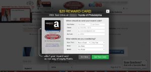
This appeared immediately, asks for a lot, and will take more than a few seconds to fill out. That’s irritating, and too much effort for a shopper who hasn’t even had a chance to see any content yet.
The solution? Before showing an offer, allow people to get oriented on your site, do some browsing on their own, and figure out how to find the information they actually want. Popups should appear after interest has already built, and then, ask for the most minimal personal information possible. One more thing: if the customer closes out the popup, accept that, and don’t continue to chase them with the same offer. Taking no for an answer will more likely lead to a yes the next time.
Bad Design
Some of the popups we saw were just not appealing, for a number of reasons: the colors were too bright and flashy, or didn’t match the branding of the dealership; the design was not aesthetically pleasing, or appeared to be chosen at random. The copy of the offer itself was unclear, or the CTA was unrelated to the offer. Even worse, there were very often two or even three popups appearing at the same time, all demanding attention. Here’s an example:
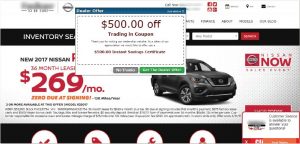
Unaesthetic design? Check. Unclear language? Check– what does “trading in coupon” mean? A strange CTA– “get the dealer offer”– and a competing simultaneous offer complete this less-than-ideal popup.
A popup should be like a display at a store: helpful, appealing, and intuitive. It should look like the rest of the website and not appear random to visitors, and all the text should make it totally clear what the offer is actually for. And one popup at a time– better yet, blacking out the screen when your offers appear to create a moment of focus– will help guide website visitors to the content you want them to see without having their attention pulled in multiple directions at once.
Irrelevance
It seems obvious: customers are more likely to convert if the content or offer they see is actually relevant to their interests. The problem is, relevance is relative: what’s useful to one shopper isn’t useful to another. That’s why it can be counterproductive to show the same popup offers to every customer, no matter what their interests are. Think of the minivan shopper who keeps seeing an offer on trucks; consider the customer who recently bought an SUV, comes back to your site to book a service, and continues to see offers on new SUVs. A lot of dealership websites do not tailor their offers to specific visitors– and that can frustrate users.
This is where smart targeting can be really helpful in tracking user behavior and deciding which offers should go to which users, and when. This also solves the timing problem– not showing an offer immediately both gives your site time to respond to behavior, and allows users to build interest so that the offer will be more likely to convert.
Bad popups abound, but they don’t have to on your dealership website. Great popups on your site will make your customers happy– and get you more leads.
What has been your experience with popups on your dealership website?