Best Practices

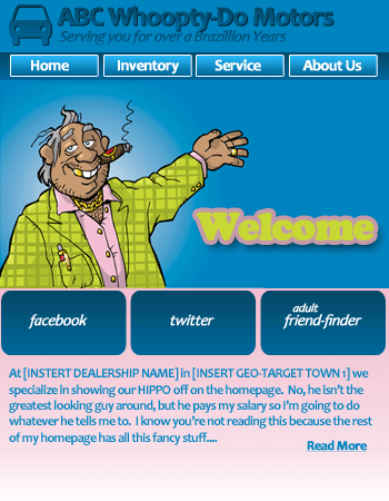
The Ego….errrr….Dealership Home Page

I have an easy job for you.  I’m in the market for a new 55″ LED TV and I need your help to find the best one that is local to me.  Sears and Best Buy are right down the street, but I have ordered a TV from B&H Photo Video before – mind checking that one too?  I need:

  1. Price
  2. Soonest Availability
  3. Best Ratings

Did you find one for me yet?   No!  What do you mean you didn’t look?  You just kept reading?  Okay – fine, I’ll tell you who this exercise is really for:  your staff or your HIPPO (HIghest Paid Person with the biggest Opinion).  You’re on DealerRefresh so you already know this stuff.

When you were searching for my TV did you go to BestBuy.com and ogle at the homepage?  Ooooo that’s a pretty button.   Wooooow look at that slideshow of specials.  Maybe they had something up there that caught your attention, but chances are your mission had nothing to do with that homepage.  Your mission started in the navigation at the top – you were looking for my 55″ LED TV and nothing else was going to deter you from finding it FIRST.

Logically, when building a website, it makes a lot of sense to start with the homepage and work your way into it from there.  I get that, but….  Why not start with the navigation?  The header?  Extra buttons and conversion points on the internal pages?  What do phone numbers look like and where are they?  Should the homepage be the last thing you put together?

If you want to start living life by the numbers here are some measurements you can use to see which parts of your website are the most valuable:

Rank your pages by form submissions
Simply go into your website’s analytics and find the report on form submissions (a.k.a. Internet Leads) and sort your pages based on the number of leads submitted.  Got a page that isn’t performing as well as you’d like?  How many views did it get?  Which brings me to the next one….

Per Page Conversion Rate
On that same form conversion report there should also be a “Visits” or “Views” column.    You simply divide the number of forms submitted by the visits or views.

Forms Submissions (Leads) ÷ Views = Conversion Rate

What is a good conversion rate?  As with all Internet metrics it is all subjective to the analytics tool used and too many other factors, so calculate your own average and start by paying attention to the pages that are below average.  Be sure to look at the pages that are above average to see what’s going on there.

Time spent on Homepage
Look at the time spent on only your Index page in analytics.  Factor out the bounce rate if your phone numbers are on it or if you have a SEO guru on the payroll.  You want to factor out the bounce rate because your homepage phone numbers might be all that customer is looking for (and you’re tracking those differently) and if you have a SEO guru pointing 5 million links at you you’re going to get a lot more unwanted traffic that bounces.  Read this about True Time on Page.

Take your bounce rate and subtract it from 100% to get the percentage of visits that didn’t bounce.  Multiply that percentage with your Average Time on Page to get your “True” Time on Page without bounces  (hopefully I put that into usable English).

What is a good metric?  This depends on whether your home page is severely action-packed, opens links in new windows, is sitting on dealership computers all day everyday, you hired a SEO consultant, or is just insanely confusing.  You’ll have to be the judge of that.

P.S.  If you export your analytics to Excel you’ll want to use this at the end of your cell that have times in them:  /60/24/60 and then format the cell to show time as hh:mm:ss to get your times in English.  Or you can borrow my Excel calculation =(((1/(E2-1)*-1))*D2/60/24/60) that should work when you export specifically from Google Analytics.

Who knew an argument with Jeff Kershner, in 2005, would lead to Alex becoming a partner with him on DealerRefresh. Where will the next argument take ...
J
I am in Alex's camp. The home page is like the front cover of a magazine. People glance at the cover, then go to the index. Granted, the cover has value, but the shopper IS ALREADY AT YOUR SITE (i.e. they have the magazine in their hands). Where do people go once they have the magazine in their hands? THE TABLE OF CONTENTS.

It's easy to get hung up on the impact of a strong visual BRANDING MESSAGE that comes from the home page, but, shopping is all about completing a task. The deeper they go into the site, the more important the page becomes to completing the shoppers needs. IMO, The most important page on a site is the VDP (Vehicle Detail Page). Cut corners here and you're rewarding your competitors for delivering a weak story with no fuel to generate a lead.

It's the ease of navigation that's the most important feature of a well designed home page.

Never judge a book by it's cover... judge it by it's well designed "Table of Contents"
N
I'm in agreement, simple, quick and direct are all very important. Good walk through on conversion rate and Time Spent too
B
@Alex

I learned that Adult Friend Finder was a social media site recently at a car dealer conference....and I think you were nearby me on that revelation.


You were supposed to keep that insider tip a secret from the automotive community. Now the cat is out of the bag.
B
@Alex

Having links pointing to a dealer's site does not necessarily increase bounce rate unless the links are on anchor text that the site has no value or navigation paths to accomodate the visitor.


If a Chicago Toyota dealer could get 1,000 or 10,000 links from external sites on the phrase "Chicago Toyota Dealers" this would be a blessing and not a curse. They are a Chicago dealer, they sell Toyota cars and if that phrase was popular in consumer search it may increase sales leads.


If those same links were on an anchor text of "Toyota Racing Parts" then those links could potentially be a waste and generate a high bounce rate if the dealer had no performance parts to sell.


That said, dealers need to analyze all their key entry pages and do more A/B testing to see which designs and layouts create the most desired results.


It would be very cool to see some documentary videos on a series of website design changes and data analysis that eventually found an optimal design that created the best results for a car dealer. I have never seen that process of A/B testing documented.
Brian - if SEO's solely concentrated on keywords that are 100% relevant (like your example), then it would be a perfect world for link-building.
J
Time on Home Page vs VDP


One Example: <a href="http://www.usedcarking.com" rel="nofollow">http://www.usedcarking.com</a>
Home Page average: 31 seconds

Average VDP: 94 seconds
E
J.D. Power and Associates just published a study today looking at the manufacturer sites. The first paragraph reads:


&quot;Websites that maintain a focus on usability along with branding and design features successfully satisfy shoppers, according to the J.D. Power and Associates 2010 Manufacturer Website Evaluation Study (MWES)&mdash;Wave 2 released today. However, the semi-annual study, now in its 11th year, finds websites that focus primarily on brand image and interesting design features can actually hinder shoppers in their search for information when usability takes a back seat.&quot;


I wonder how much they spent putting that together - All they needed to do was call Alex!

<a href="http://www.jdpowercontent.com/OARBlog/finding-happy-medium-between-branding-and-usability-not-always-an-easy-task/" rel="nofollow">http://www.jdpowercontent.com/OARBlog/finding-hap...</a>
C
&quot;The home page is like the front cover of a magazine. People glance at the cover, then go to the index. Granted, the cover has value, but the shopper IS ALREADY AT YOUR SITE (i.e. they have the magazine in their hands). Where do people go once they have the magazine in their hands? THE TABLE OF CONTENTS.&quot;


This is the only thing you need to pay attention to when building a home page......I wish we were a touch less vain and simplified ours some more, but it started in a whole other direction before I got this advice from Uncle Joe. When you look at your homepage in the &quot;magazine cover&quot; method it will become better. This is one of my favorite tidbits in my list of Joe Pistell classics!
B
  • B
    Bruce Novicky
  • July 29, 2010
The magazine theory is fine, but keep in mind when someone looks at the front of the magazine they usually find the first article they are going to read right on the cover.


&quot;The Secret to losing 10lbs in 10 days&quot;


&quot;Peyton Manning, set to retire...&quot;


Magazines use their cover to pull you deep into the magazine, your home page should be the same it should direct people where YOU want them to be not where they want to wind up.
J
oooo Bruce, we&#039;re on the same wave length. I&#039;ll take it a lil&#039; deeper.


The cover of the magazine has a title (Life, Sports Illustrated, etc...), the big a** picture tells us what the magazine has inside AND your invite to the 1st article &ldquo;The Secret to losing 10lbs in 10 days&rdquo; is nested on the cover.


The picture can connect broadly to the theme of the magazine, or, the cover pic can feature the 1st article...&ldquo;The Secret to losing 10lbs in 10 days&rdquo;


Also,, you can reduce the size of &ldquo;The Secret to losing 10lbs in 10 days&rdquo; to a give it a less dominant role on the cover where it shares space with other &quot;sub-title&quot; merchandising hooks, all designed to take you inside.


Any way you slice it or dice it, &ldquo;The Secret to losing 10lbs in 10 days&rdquo; is an extension of the table of contents, its just placed on the front cover.
J
Bruce writes &quot;...Magazines use their cover to pull you deep into the magazine, your home page should be the same it should direct people where YOU want them to be not where they want to wind up.&quot;


ahh... where did that come from? You can&#039;t strong arm in marketing or merchandising... only in sales... oh, that&#039;s where you get that from!


Give me one example of how you think you can sell more cars while taking them further away from &quot;accomplishing their goal&quot;.


Marketing and Merchandising has a job. It&#039;s job is to find shoppers, help them satisfy their needs, then hand the shopper off to sales.


Sales and marketing are on the same team but have very different skill sets.
J
ohoh...


&quot;...Give me one example of how you think you can sell more cars while taking them further away from &ldquo;accomplishing their goal&rdquo;.&quot;


Open mouth.. insert foot.
<a href="http://www.terryvillechevy.com/" rel="nofollow">http://www.terryvillechevy.com/</a>
Nice Job Bruce. VERY VERY creative cover. Kudos!


On your landing page <a href="http://www.terryvillechevy.com/WebSiteSurvey" rel="nofollow">http://www.terryvillechevy.com/WebSiteSurvey</a> I wish you had more space to hammer home the features and benefits of your cash for clunkers program (call to actions, expiration, etc...)


Great work!
C
Bruce,

I agree your homepage should have offers that compel people to dig further into your site......however where we seem to go in another direction is in making that experience match why they are looking. Not to pick apart your site/store.....but if I was a customer looking at your site I would find an offer for &quot;2010 malibus for $17998.&quot; hey sounds good let me look at that, I say and click. Turns out those vehicles must either be sold or I am supposed to forget about that offer and pay the $21310. you really have them for.......O.K so maybe a Malibus not in the cards today, let&#039;s take a look at the &quot;Cash for Clunker&quot; special offer page. Great all I have to do is provide every piece of my personal information to have a Manager call me to tell me if I may qualify for a trade towards a something, excellent sign me in!


Like I said I don&#039;t want to tear into your site or business philosophy.......but, I&#039;d rethink the &quot;offer them something to get em in and we&#039;ll grind it out when they get here&quot; at least appearance of how deals are done at Terryville.

Just my 2 cents, Craig
B
  • B
    Bruce Novicky
  • July 29, 2010
Joe - I tried the passive &quot;marketing&quot; &quot;branding&quot; approach with our homepage and it got us nowhere in terms of leads. So now I try to have a few things that pull certain crowds right into the thick of things, while letting those further out still poke around. It has actually worked REALLY well, I never expected so many people to send through requests seeing if we would give them &quot;up to&quot; $3,500.


Craig - If you had a 1991 hunk of junk, you would be very curious and WANT a manager to call you to tell you he can give you thousands more than it is worth. Obviously it is not your situation so it does not appeal to you. As for the $17,998 Malibu button, that is also aimed at a specific crowd that is obviously not you. It is no different than a newspaper ad advertising a $16,995 Chevy Silverado, everyone knows it is a stripped 2WD but it builds the price leader image and the customer thinks they can then get a rock bottom price on the trim of their choice. I want someone to call me asking how they can buy a $17,998 Malibu the key their is BUY one not confirm they could SHOP for one on my website.
Bruce - sure sounds like you&#039;re going after the suckers. Old school bastardizing that gives us all a fantastic name....thanks!
D
  • D
    Dara
  • July 29, 2010
As a designer of automotive websites the content of the homepage is something I am constantly battling (for lack of better terms with the dealer). There are many out there with the mindset of the more on the homedeck the better oh and don&#039;t forget it all needs to be above the fold. I have to walk that very fine line everyday. One side is gently guiding the dealer towards a quality website, one where the user interface is welcoming and easy, the navigation is clear, and simply an enjoyable experience all around. While the other, is delivering the dealer a product that they will be happy with, even if it means I need to give them a huge neon orange specials banner if they are set on it. But again that goes back to the fact of do they want to be educated about how the customer will interact with their site or are they set in what they &quot;think&quot; will sell more cars.


I am the first to admit I am guilty of producing some (what I think) are pretty ugly dealer websites out there, along with what I consider stunning ones as well. But you know what at the end of the day the dealer is happy with the end result. And honestly, if the dealer is happy with their website and proud of it they will promote it every chance they get, and in return sale more cars. At the end of the day isn&#039;t that what it&#039;s all about?
B
  • B
    Bruce Novicky
  • July 29, 2010
Alex - I just happened to be going after price shoppers this month. Nothing sleezy about it I really could sell a Malibu LS for that price and I really can give up to $3,500 for a clunker. It is no different than Checkered flag pushing you to click on &quot;Last Chance Deals&quot; you are going after the bargain hunter.


Next month I have a promo that will push 2011&#039;s on the surface but is really all about creating urgency on the 2010&#039;s. Nothing sleezy about it, I really do have truckloads of 2011 vehicles showing up and they really are not making any more 2010&#039;s.


We really did give some good money and take a hit in order to get some folks who had not bought a car in 10+ years out of their &quot;clunker&quot; and back into the buying/service cycle.
J
Let your visitors tell you what they like.

Run this software for a few thousand visits. <a href="http://www.crazyegg.com/" rel="nofollow">http://www.crazyegg.com/</a>


What happens? 1st, look at my home brew indie site: <a href="http://www.usedcarking.com/" rel="nofollow">http://www.usedcarking.com/</a>

Form your opinions about it... C&#039;mon, be honest &gt;:-/


then compare your opinions to2 days, 8hours and 10 mins of traffic, see it at:
<a href="https://docs.google.com/fileview?id=0B-Yg7lix-ly6YWMyYTkxODctMzU0NC00ZTBjLTg4MTgtN2JjNTZhMmQxZTZh&amp;hl=en" rel="nofollow">https://docs.google.com/fileview?id=0B-Yg7lix-ly6...</a>

A picture tells a thousand words...
J
Same goes for all classes of pages, here is a VDP analysis:


sample:
<a href="http://www.usedcarking.com/2008-Ford-Escape-4dr-SUV-Automatic-XLT-PT33840" rel="nofollow">http://www.usedcarking.com/2008-Ford-Escape-4dr-S...</a>

test:
<a href="https://docs.google.com/fileview?id=0B-Yg7lix-ly6OWVkNjkyMmItM2IzMS00NTQ3LWE3M2EtMjI2NWUxMzM0NDRi&amp;hl=en" rel="nofollow">https://docs.google.com/fileview?id=0B-Yg7lix-ly6...</a> (use the zoom feature on the right)


What do I see?


BAD: Navigation errors. People clicking the home button to too often.


BAD: Photo advance buttons not used.


BAD: Specifications tab is clicked, most likely people looking for options (placed too low on page)


BAD: Clicks to Store hours and directions takes us AWAY from bright shiny yummy object of desire. Not smart.


WHY?: Why do they click on price ($2000 down). They looking for a finance calc? Looking for the calcs used in that payment?


(test = 150 visits, 502 clicks over 12 days 22 hours )
J
Bruce writes: &quot;Joe &ndash; I tried the passive &ldquo;marketing&rdquo; &ldquo;branding&rdquo; approach with our homepage and it got us nowhere in terms of leads.&quot;


Bruce,


1st the good news... Your &quot;hook&quot; on the front page is unique and has a call to action. I didn&#039;t get into the sloppy bait n switch stuff but I love the hook. You ALSO are wicked smart by littering the hook all about the site to re-enforce your home page promo. Smart, damn smart.
Bruce - the way you worded your post it sure sounded like you were playing &quot;bait and switch&quot;. It is quite the opposite of how the &quot;Last Chance Deals&quot; section of Checkered Flag.com works.
J
Well Bruce... now the bad news.


The reason you were getting &quot;no where&quot; with the leads is because your VDP merchandising sucks (VDP = Vehicle Detail Page).


Lets say I am 45 mins from you, shopping for a high end SUV. I&#039;ve bought nothing but BMW&#039;s my whole life, but a gal I&#039;m dating LOVES the Caddilac Escalade.


Your Caddy comes up in a search with a favorable price, so I look deeper: <a href="http://www.terryvillechevy.com/VehicleDetails/750287683" rel="nofollow">http://www.terryvillechevy.com/VehicleDetails/750...</a>

Is there any warranty left on it?


Ah... what is that red specials box? It must not be a special price on this on. I don&#039;t get it.


Ok, I&#039;ve had a I want a loaded up SUV to make my new gal all happy, skip the standard equipment, what it got for options????


Installed Options


* Air Conditioning

* Anti-Lock Brakes

* Automatic Transmission

* Power Brakes

* Power Steering

* Power Windows


What?? No options! No wonder it&#039;s cheap!

OUCH. (Ok, you lost a few shoppers here, lets continue)


You look at the standard options and the 1st one is...


Oh good!! I see it comes with 3 months of XM and 12 months of Onstar Directions &amp; Connections plan.(TOTALLY WRONG! you can thank Chrome for that junk)


More Chrome JUNK:

Wheels, 4 - 18&quot; x 8&quot; (45.7 cm x 20.3 cm) 7-spoke aluminum (Requires (QXK) P265/65R18 all-season, blackwall, TL AL2 tires. Includes 17&quot; spare. Not available with (ULT) Platinum Edition.)


ahh.... WTF is that crap?


Look at all the NOISE in there!

# Luggage rack center rails

# Fascia, front, body-color

# Fascia, rear, body-color

# Moldings, color-keyed bodyside with chrome accents

# Floor covering, color-keyed carpeting

# Floor mats, color-keyed carpeted first and second row (WARNING WARNING WARNING!)

Console, overhead deluxe, with reading lights and (UG1) Universal Home Remote (Includes sunroof controls when (CF5) power sunroof is ordered.)...Oh?!! Does it have a sunroof?

Throttle control, electronic


Bruce,


Your situation here is quite normal. But, I can tell you, your vehicle info is difficult and time consuming and you site does not help me shop faster and smarter. I am not sending you a lead and I am not coming back.


The VDP is where you put all your effort into. Its here, the VDP, this is where they&#039;re going. Give them your best effort on the VDP!!
E
I spent the first hour of my day watching a webinar from a year ago titled &quot;The 7 Deadly Sins of Landing Page Design with Tim Ash&quot; (search for it on YouTube). Tim is one of the real Thought Leaders on site design and testing. The 7 sins he enumerates are perfect for this conversation.


1. Unclear Call-To-Action

2. Too Many Choices

3. Asking For Too Much Information

4. Too Much Text

5. Not Keeping Your Promises

6. Visual Distractions

7. Lack of Credibility &amp; Trust


So first, where do we want our visitors to go? For most of us there are only a few priorities: New Cars &amp; Used Cars, maybe a Special Finance page or Parts page. This is our call-to-action: to get them to those pages. Joe and I see completely eye to eye on this - get them to a VDP quickly and easily and make that VDP stand tall!


Sin #3 is asking for too much information. But Tim goes on to state that the problem is when you ask before earning trust. That&#039;s the problem with the Cash for Clunkers offer above. It&#039;s teased on the home page and then we go right to a submission form. Sell me a little bit before you ask for my mothers maiden name.


Words like &quot;bait and switch&quot; have been tossed around here, but the key to avoiding Sin #5 is to deliver what you promise. If that&#039;s a $17,998 Malibu, give me $17,998 Malibu (you can always upsell later where it&#039;s appropriate). This plays to Sin #7 as well. We got &#039;em on the site so let&#039;s not screw it up.


Almost everyone has been guilty of Sin #6. Use restraint and testing to make sure you accomplish your goals and not just stroke your ego.


Tim Ash is a really smart, interesting guy. Watch the video of the webinar or grab his book &quot;Landing Page Optimization&quot; (it&#039;s the bible of this stuff).
Ed - THANK YOU THANK YOU THANK YOU for suggesting to watch that webinar! He is soooooo right.
J
My homepage heros:
<a href="http://www.mailchimp.com/" rel="nofollow">http://www.mailchimp.com/</a> <a href="http://www.me.com/" rel="nofollow">http://www.me.com/</a>


Balance that against the most powerful money making highly optimized system of our day
<a href="http://www.amazon.com/" rel="nofollow">http://www.amazon.com/</a>

Amazon design is not sophisticated, artistic, or pleasing to the eye. Yet, the design is wildly successful. Amazon&#039;s Design has one design goal... satisfying the shoppers needs.
J
Open Confessions of a closet HIPPO.

I create my designs, I build the photoshop layouts for my team to follow. I use instincts to tell me whats needed and getting my ego out of the way isn&#039;t easy. I must avoid altruistic design goals that are made to please to me (or my sophisticated peers). This is ego driven planning and that reeks of ikky HIPPO thinking.

I must design/build with one goal, to reward the shopper with an experience that helps them gather facts and dosen&#039;t get in the way of completing their task.

I use my instincts to design, but, the numbers are the boss. If I do it right, or, if I want to make it better, I&#039;ll see it in the traffic &amp; conversion stats.
B
  • B
    Bruce Novicky
  • July 31, 2010
Well with my hands tied by Cobalt I have not found a solution that makes sense time-wise for the VDP, just do not have the hours or man power to customize them deeply.


The $17,998 Malibu exists, no bait and switch the intention of not having one specific one on the site at that price is to get the phone call/email to inquire. Also it is there to build a price leader branding.


I understand the trust issue, but like I said before you might not want to fill out a form right away because you are not a &quot;clunker&quot; customer. It does not appeal to you, and that is fine but to many it is appealing and easy.


One thing I try to do when thinking up things like the &quot;clunker&quot; promo is get in the mind of the customer you are targeting. A clunker customer does not usually care what size wheels a certain vehicle might have or if we have the Cobalt 2LT in red with a roof. They want to know if I can give them $3,500 for their 89&#039; Cavalier.


Also it blatantly says right on the image &quot;click to see if you qualify&quot; so most who are clicking that intend to fork over some info in order to qualify.
Joe, funny you mention MailChimp. I&#039;m in design right now and using that sites homepage as reference. Too funny.

Although it will have some HIPPO elements. :)
J
To pull off a &quot;mailchimp&quot; layout, IMO, you need to NAIL the entrance buttons to perfection, plus, because we&#039;re more like a multi-product catalog than a single product offer, the navigation system needs to be more &quot;robust&quot;.

That being said, my design thoughts are wrapped around a pyramid now. I can&rsquo;t build it here, a graph will get the idea across:

Navigation/Content Map

....Home.Page

................Make Pages

&hellip;&hellip;.................Class Pages

............................Make Model Pages

&hellip;...................................VDPs

Information-----&gt;

Time on Page------&gt;

The deeper the shopper drills, the closer they are reaching to their target. They&rsquo;ll be open to more &ldquo;content&rdquo; the deeper they get. At the top of the pyramid (chart), keep it clean and with every step closer to the VDP, get more aggressive with content and offers.

Looking at our tradein records, I see that people are much more likely to buy a similar class than the make/model they&#039;re trading in (e.g. sedan buyer buys another vs Ford Taurus buys another Taurus).

I am CONVINCED that web shoppers are very open to suggestion. Make EVERY EFFORT to serve up similar inventory that is in it&#039;s class

Oh... Don&#039;t forget I look at everything thru a used car prizm.
Joe, in your own fashion (why we all love you), you took it deeper than what I was thinking.


&quot;because we&rsquo;re more like a multi-product catalog than a single product offer, the navigation system needs to be more &ldquo;robust&rdquo;.&quot; This became the issue as I got deeper into the design. You might see a few resemblances but I&#039;ll be limited to design restrictions.


We&#039;ll see how it goes.
J